coachhansbro.com · website directions

Choose your website.

Nine complete designs for Coach Hansbro’s site. Same words, same booking calendar, same waiting list; nine different personalities. Every one is live: open it on your phone and on your laptop.

Directions
9
Blind reviewers
6
Decision
1

The panel’s pick

B · Gold

The most balanced of the nine: it looks like an established premium program, answers a parent's first questions on the first screen (roster full, ages, format) and keeps booking and the waiting list apart. Four of the six reviewers put it first or second; the web designer found its gold buttons and icons template-like. The top three are within one point, so Blacktop and Hardwood are real alternatives.

85.3/100 average · 2 of 6 favourite votes

“It looks like a real, established program, tells you ages and format up front, and shows the path all the way to D-I.”

His mom

“Black and gold with a real crossover photo and a hype quote, looks expensive and legit.”

Varsity guard, 16

“It shows a kid training with the coach, tells you right away the roster is full, and gives you a big clear waiting-list button.”

Mom of a 7th grader

The directions · best-scored first

Nine ways to say “elite coach”.

Each card shows the first screen on a laptop and a phone, and the whole page in three columns. Tap a card to open that version; your browser’s back button brings you here.

  • #1

    BGold

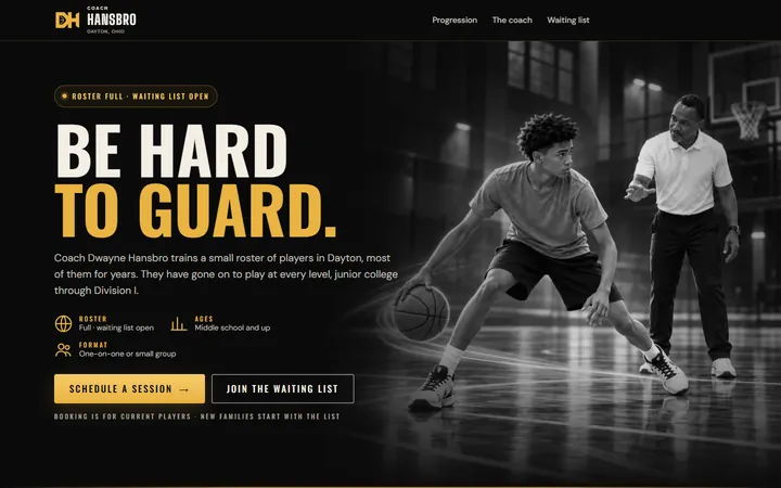
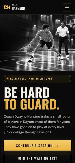
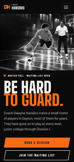
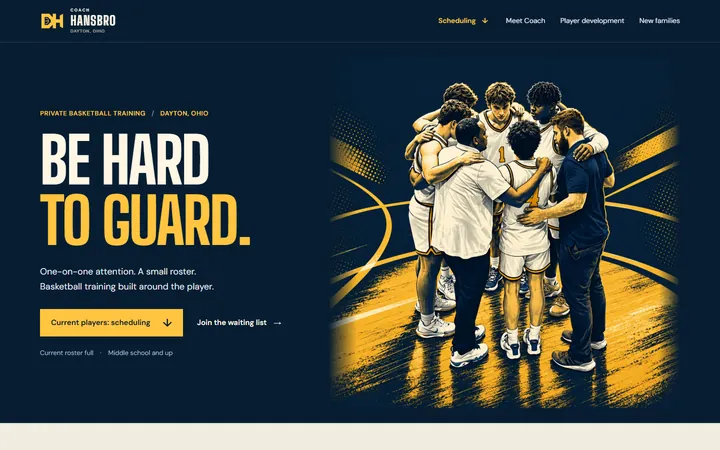
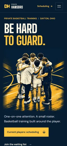
    Black and gold with the facts up front and the schedule first. Premium and clear.

    Oswald + DM Sans

    “Be hard to guard.”

    85.3Panel pick

    “It shows a kid training with the coach, tells you right away the roster is full, and gives you a big clear waiting-list button, so it feels professional and easy.”

    Mom of a 7th grader
    The whole B page on a laptop, in three columnsThe whole page on a laptop · tap to enlarge
  • #2

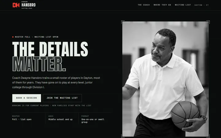
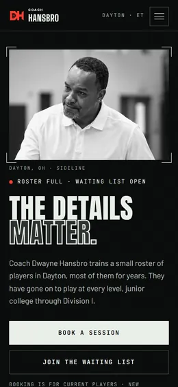
    ABlacktop

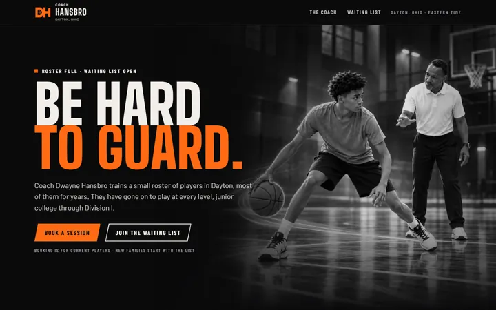
    Asphalt black, the ball's orange and poster-size type. Loud and athletic.

    Big Shoulders Display + Barlow

    “Be hard to guard.”

    84.7

    “Bold, athletic and dead clear about booking versus the waiting list; this is the one I'd send to other parents.”

    His dad
    The whole A page on a laptop, in three columnsThe whole page on a laptop · tap to enlarge
  • #3

    FHardwood

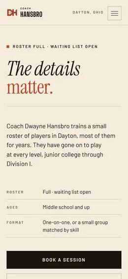
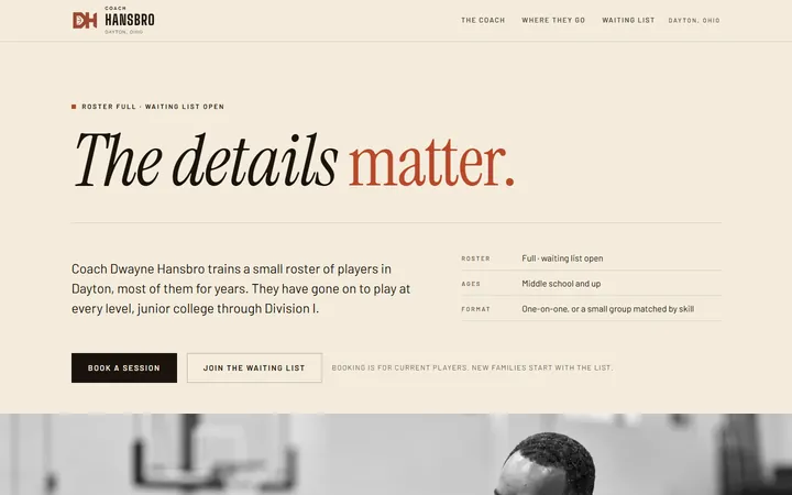
    A printed program: bone paper, serif type, brick red. Quiet and confident.

    Instrument Serif + Barlow

    “The details matter.”

    84.3

    “The best typography of the nine, lovely on a phone, though its literary calm undersells the sport.”

    Web designer
    The whole F page on a laptop, in three columnsThe whole page on a laptop · tap to enlarge
  • #4

    CHuddle

    Navy and gold with illustrated artwork and cream sections. Warm, like a program.

    Big Shoulders Display + DM Sans

    “Be hard to guard.”

    81.0

    “The only one that feels like a brand: halftone navy-and-gold art, disciplined type and the clearest two buttons of the lot.”

    Web designer
    The whole C page on a laptop, in three columnsThe whole page on a laptop · tap to enlarge
  • #5

    ETape

    The film room: green-black, monospace details, one signal red. Analytical and sharp.

    Anton + JetBrains Mono

    “The details matter.”

    80.7

    “You see the coach's face first and get the key facts right away, but the typewriter-style text is hard on the eyes.”

    His mom
    The whole E page on a laptop, in three columnsThe whole page on a laptop · tap to enlarge
  • #6

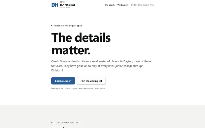
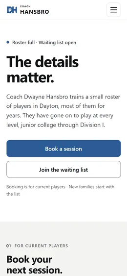
    JSimplicity

    White, one calm blue, system type. The lightest and fastest page.

    System fonts

    “The details matter.”

    80.0

    “Plain as a template, but the easiest to read and act on, and the calendar looks like it actually works.”

    Dad of an 8th grader
    The whole J page on a laptop, in three columnsThe whole page on a laptop · tap to enlarge
  • #7

    INoir

    The Gold Rush layout in black and white. The same energy, more restraint.

    Big Shoulders Display + DM Sans

    “Your game. Built to last.”

    75.7

    “Clean black-and-white hype look, but the text is tiny and the waiting list is easy to miss.”

    Varsity guard, 16
    The whole I page on a laptop, in three columnsThe whole page on a laptop · tap to enlarge
  • #8

    GGold Rush

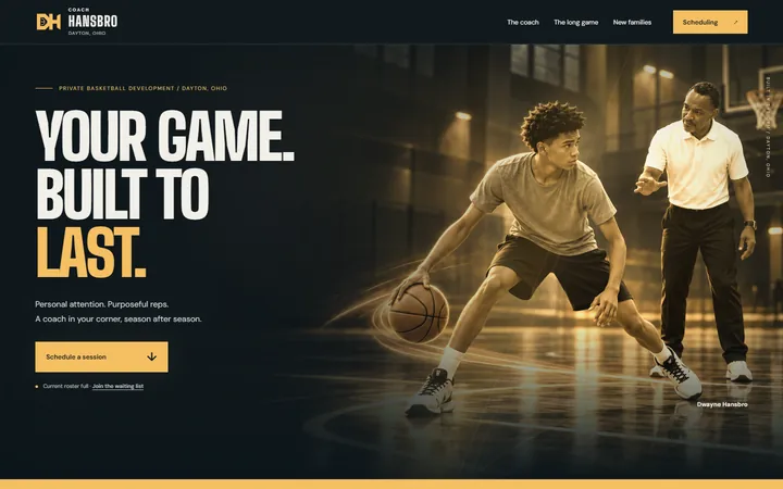
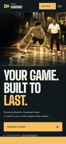
    Cinematic coaching scenes with a warm gold wash. A campaign look.

    Big Shoulders Display + DM Sans

    “Your game. Built to last.”

    74.0

    “Warm and inviting, but the golden photos look filtered and you have to hunt for the waiting list.”

    His mom
    The whole G page on a laptop, in three columnsThe whole page on a laptop · tap to enlarge
  • #9

    HEditorial

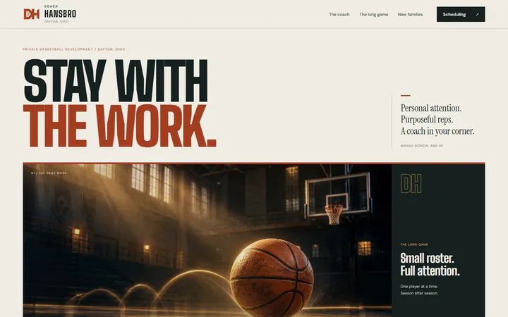
    Cream and rust, a wide basketball picture, magazine pacing.

    Big Shoulders Display + DM Sans

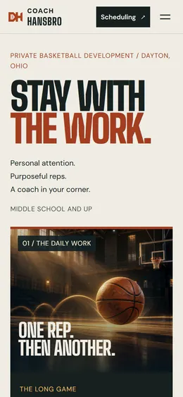
    “Stay with the work.”

    70.5

    “Pretty magazine style, but the first screen shows a glowing ball instead of the coach and hides the waiting list.”

    Dad of an 8th grader
    The whole H page on a laptop, in three columnsThe whole page on a laptop · tap to enlarge

Blind review · September 16, 2026

How the nine scored

Six AI reviewers, each briefed as a different person, scored four screenshots of every version (laptop and phone, first screen and whole page) without knowing which version was which: the versions carried random codes and each reviewer saw them in a different order. Scores are out of 100 and averaged. These are AI judgments of screenshots, not a survey of real families.

The panel

  • Mom of a 7th grader
  • Dad of an 8th grader
  • Varsity guard, 16
  • His mom
  • His dad
  • Web designer
  1. B · Gold85.3★★
  2. A · Blacktop84.7★★
  3. F · Hardwood84.3★
  4. C · Huddle81.0★
  5. E · Tape80.7
  6. J · Simplicity80.0
  7. I · Noir75.7
  8. G · Gold Rush74.0
  9. H · Editorial70.5

Meet the panel

The reviewers are AI models, each given one point of view; the sketches are illustrations, not real people. Two things they caught were fixed the same day: a missing space in the booking heading on phones, and the spacing of Tape's level strip and footer.

  • AI reviewer

    Mom of a 7th graderMother of a 12-year-old on a school and a travel team; reads on her phone between things.

    Looked for Trust, easy reading on a phone, and knowing right away what a new family should do.

    Favourite: B · Gold

    “The best ones put the roster-full message, two clear buttons and the ‘new families start with the list’ note right on the first screen, and that is what a busy parent needs. The ones that push one big scheduling button and hide the waiting list in small print are exactly how a new family ends up in the wrong place.”

  • AI reviewer

    Dad of an 8th graderFather of a 13-year-old trying to make his high-school team; coached youth basketball; skeptical of hype.

    Looked for A credible coach who develops kids over years, straight information, easy to act on.

    Favourite: F · Hardwood

    “Most of these share the same bones, so what separates them is whether the coach looks like a real person and whether a new family can find the waiting list without hunting. The calm ones and the one with an honest portrait up top earned my trust; the sneaker-ad heroes felt like hype.”

  • AI reviewer

    Varsity guard, 16Varsity point guard at a Dayton high school who wants to play in college.

    Looked for Does it look elite and legit enough to send to teammates, and is anything corny or fake.

    Favourite: A · Blacktop

    “The dark ones with a real player-and-coach photo look the most like a legit trainer I’d actually brag about, and the black and orange one feels like a real sneaker brand. The clean light ones are easy to read but look like a doctor’s office or a magazine.”

  • AI reviewer

    His momMother of a 16-year-old varsity guard; plans the next two years around college; compares trainers on her phone.

    Looked for Credibility for a college-bound player, clear information for parents, trust with her son’s time.

    Favourite: B · Gold

    “Most of these look professional, but they differ a lot in whether a parent can tell in five seconds who can book, who must join the waiting list, and what ages and formats he takes. Gold and Hardwood did that best while still making me trust the coach with my son’s college goals.”

  • AI reviewer

    His dadFather of a 16-year-old varsity guard; runs a small business; looks on a laptop first and notices anything unfinished.

    Looked for Professionalism, how booking and the waiting list work, worth it for a college-bound player.

    Favourite: A · Blacktop

    “The dark, bold ones feel most like a program that gets kids to college. Blacktop gets the balance right between looking serious and making it obvious what current players and new families should do; Simplicity is the clearest but looks like a template.”

  • AI reviewer

    Web designerSenior, internationally award-winning web designer and awards judge; has led design for sports and lifestyle brands.

    Looked for Craft and originality, typography, grid and spacing, how each layout adapts to the phone, finish.

    Favourite: C · Huddle

    “Craft and art direction decide this round. Huddle is the only one with a real visual identity and Hardwood has the best typography; after those, Blacktop has conviction while the rest are good templates or unfinished ideas. Simplicity is the most usable and the least designed.”

Every score
VersionMom of a 7th graderDad of an 8th graderVarsity guard, 16His momHis dadWeb designerAverage
B · Gold90818889867885.3
A · Blacktop88768983898384.7
F · Hardwood85867688858684.3
C · Huddle84748378808781.0
E · Tape81828284817480.7
J · Simplicity82857582837380.0
I · Noir75717780737875.7
G · Gold Rush73697479727774.0
H · Editorial71707073687170.5

Out of 100: look and feel 30, readability 20, phone 20, clarity 20, polish and trust 10. Highlighted: each reviewer’s favourite.

Brand

One coach, one look.

The DH mark

Dwayne Hansbro’s initials, drawn around a half-court line. It works in one colour at any size: the site header, the browser tab, a shirt, an Instagram avatar. Give it room, never stretch it, never add effects.

Colour

Pick one accent and spend it on purpose: the main button, one word in the headline, the top level (D-I). Everything else stays in the neutrals.

  • Blacktop#0A0A0B
  • Bone#F2EFE8
  • Ball orange#FF6A13

Each direction brings its own accent (see the swatches on its card). Whichever wins becomes the brand colour everywhere.

Type

Be hard to guard.

A tall, condensed display face for headlines and a plain, readable face for everything else. Short headlines, sentence case in body text, no more than two fonts on a page.

Photography

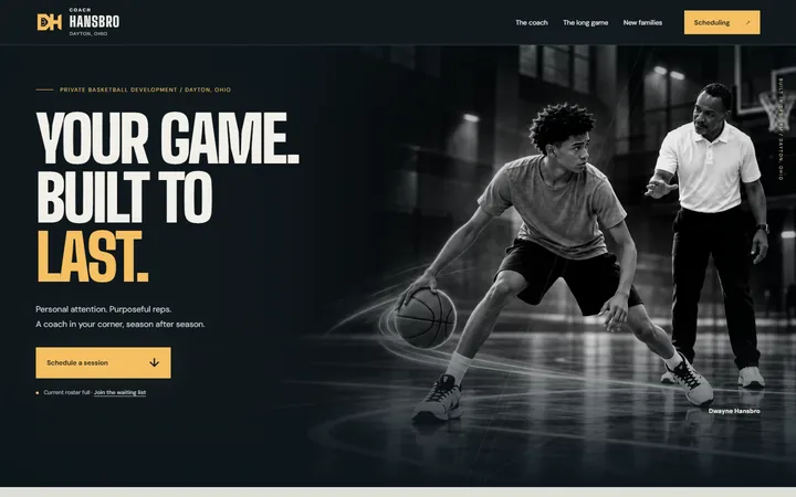
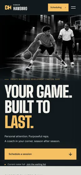
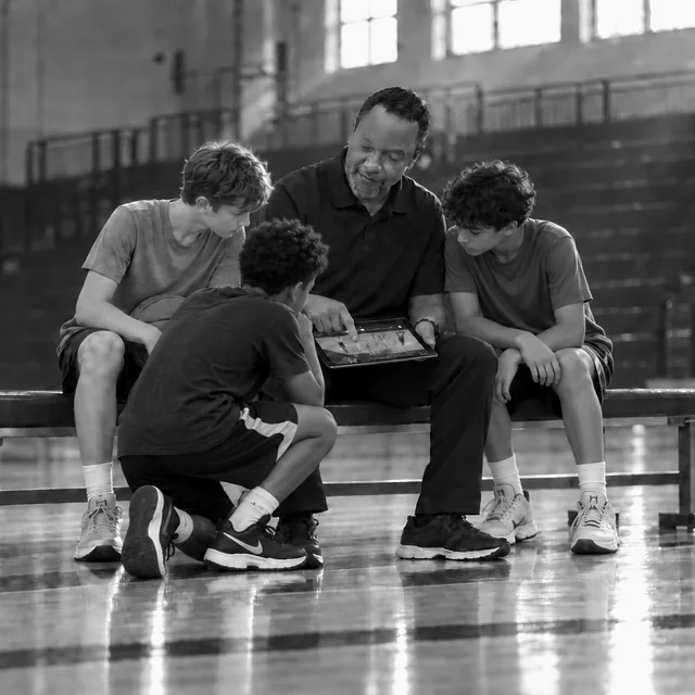
Black and white, candid, in the gym: Coach teaching, a hand on a shoulder, a clipboard or a tablet, the work in progress. No trophies, no posed handshakes, no heavy filters. The current coaching scenes are stand-ins created from Coach’s photos; a real session shoot will replace them.

Coach Hansbro and three players reviewing game video on a tablet

Voice & lines

Direct, calm, coach-speak. Short sentences. Talk about the work and the player, never hype.

  • Be hard to guard.Headline. Short, physical, a player's goal in four words.
  • The details matter.Headline or sign-off. The coaching philosophy in three words.
  • Stay with the work.Sub-line. Speaks to the long relationship: players stay for years.
  • Your game. Built to last.Campaign line for social posts and the share image.
  • I build a game that travels.Coach's quote. Keep it in his voice, once per page.

Content

What would make it stronger.

The design is only as convincing as what it shows. In order of impact:

Deliberately left out

  • Phone number and email (the waiting list reaches Coach)
  • Prices and payment instructions
  • Awards, schools and a résumé
  • Photos of minors without written permission
  1. 01

    Real photos from a session

    One hour in the gym with a photographer: Coach teaching, hands-on, small group, in black and white. The coaching scenes on the pages today are stand-ins created from Coach's photos; real moments build more trust. Only show players whose parents have given written permission.

  2. 02

    A short parent FAQ

    Ages, one-on-one or small group, the part of town where sessions happen, what to bring, how the waiting list works and roughly how long the wait is, and how to reschedule (through the booking email).

  3. 03

    What a session looks like

    Three plain steps, for example footwork and ball-handling, a skill block, then game reps. Parents want to picture the hour before they ask for it.

  4. 04

    Words from current families

    Two or three short quotes, first name and “parent of a 9th grader”, with their permission. The strongest proof for a full roster.

  5. 05

    Where players went, with permission

    A few first-name milestones (“Marcus: middle school → D-II”) back up “every level of the game” without turning the page into a résumé.

  6. 06

    One consistent profile

    Use the DH mark as the avatar and the same headline on Instagram, Google and the share image, so every link looks like the same coach.

Next steps

From choice to live.

Six steps, most of them one message from Coach.

  1. Choose a direction

    Pick one, plus a runner-up. Everything below is shared, so any direction can go live.

  2. Approve the pictures of you

    The coaching scenes were created from your photos. Say which ones look like you, or book the photo session.

  3. Send the booking link

    Your Calendly link turns the booking calendar on for current players.

  4. Connect the waiting list

    We connect the sign-up to your email so new families reach you.

  5. Donate link (optional)

    A Cash App link turns on the Flyght Academy donate button.

  6. Go live

    The chosen direction becomes the homepage; the others stay private.